I've written before about the motivation for fresh, deep job market insights, breaking down job titles into the skills that make them up.
The Skills Graph is a natural progression from that, exploring the related skills without being rooted in job titles.
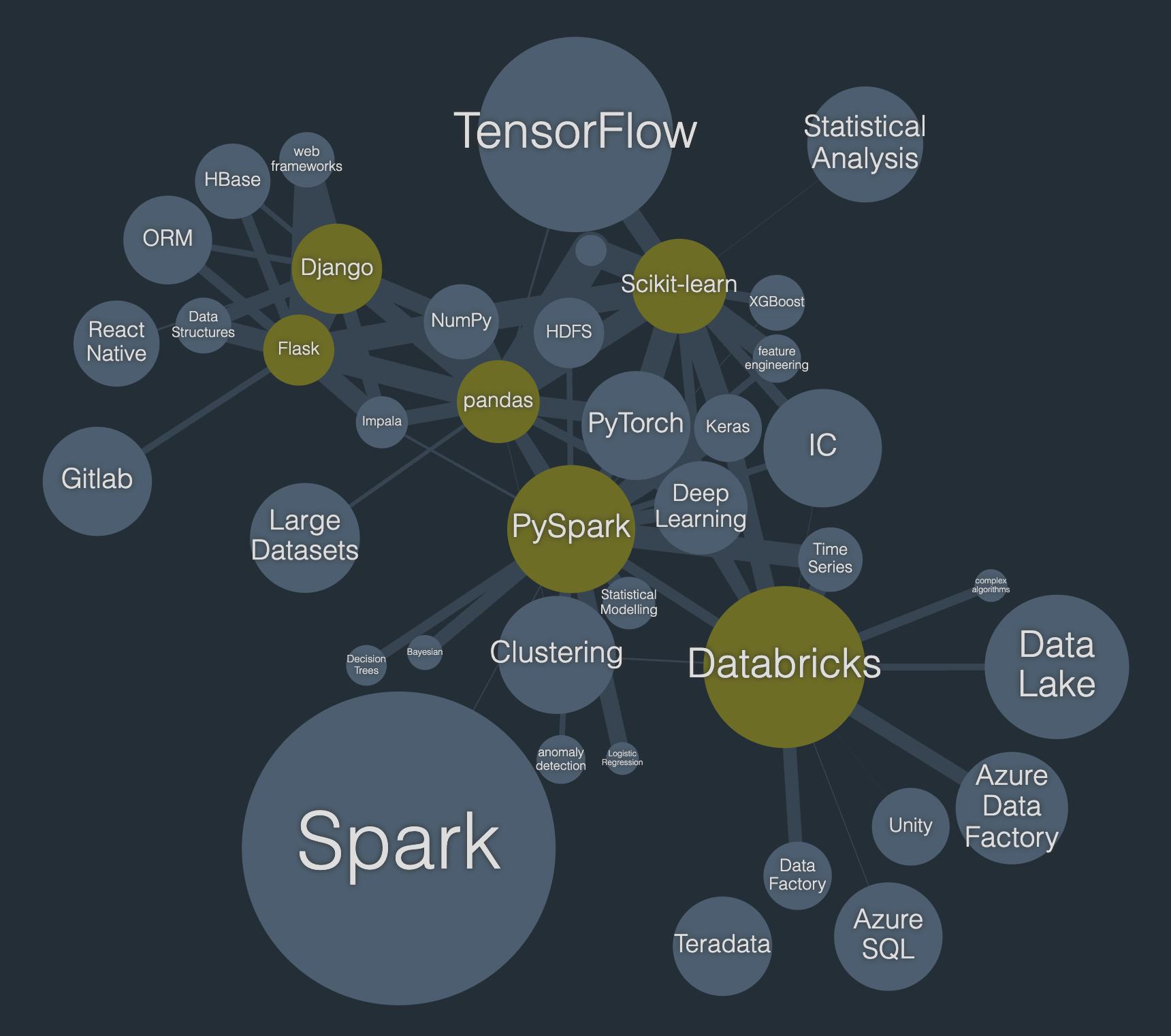
It's a pretty intuitive visualisation. The size of the skill 'bubbles' reflects their popularity in job posts and the links show the relatedness between them with thicker links indicating stronger statistical associations. By tuning a cut-off point for the association, you can get a nice little visualisation of skillsets as clusters.

If the network is looking a bit sparse then hit [+] to see more skills related to the selected ones. Likewise, hit [-] to thin it out if it's getting crowded. You can similarly add spacing to the graph to show the structure more clearly or reduce the spacing to get more skills in less space.
You can click any skill to show skills which are also related to that, with the same threshold. Rather than being rooted in job titles, it's purely about skills and how they are related. If you don't select any skills then it just shows an abridged, top-level view.
If you're a tech professional, you should recognise skills and their clustering. You might discover new skills which you want to look into. Or the relative demand for skills you already have might influence the time you spend on them going forward. Since this has recurring updates, it's worth checking back regularly.
There's a natural flow from the titles page to select core skills before progressing to the skills page to refine a custom skill selection. It's not necessary, though.